The (data) stories we tell ourselves
Can geometric shapes be a**holes? What can Heider and Simmel's moving shapes tell us about interpreting visualizations?
Can geometric shapes be a**holes? What can this tell us about interpreting visualizations?
This is a video clip from a famous experiment, published in 1944, by psychologists Fritz Heider and Marianne Simmel. Take ~47 seconds to watch it. It’s worth it, we promise! There’s no sound (just background noise), it’s safe for work, you can play it wherever.
Video clip from Heider and Simmel, 1944
Pause! Ask yourself: What did you see happening in this video?
If you’re like most people, you imagined a fairly elaborate, perhaps dramatic story about these little shapes, as live characters, moving about the screen. For example, one participant in the original study described the scene in great detail:
“A man has planned to meet a girl and the girl comes along with another man. The first man tells the second to go; the second tells the first, and he shakes his head. Then the two men have a fight, and the girl starts to go into the room to get out of the way and hesitates and finally goes in. She apparently does not want to be with the first man. The first man follows her into the room after having left the second in a rather weakened condition leaning on the wall outside the room. The girl gets worried and races from one corner to the other in the far part of the room. Man number one, after being rather silent for a while, makes several approaches at her; but she gets to the corner across from the door, just as man number two is trying to open it. He evidently got banged around and is still weak from his efforts to open the door. The girl gets out of the room in a sudden dash just as man number two gets the door open. The two chase around the outside of the room together, followed by man number one. But they finally elude him and get away. The first man goes back and tries to open his door, but he is so blinded by rage and frustration that he can not open it. So he butts it open and in a really mad dash around the room he breaks in first one wall and then another."
Note that in the video:
- The shapes are anthropomorphic. We see them as living things.
- There’s cause and effect. We see the big triangle push the little triangle.
- There’s motive and intent. The triangles are fighting for a reason.
- There’s a very real feeling of menace, as the big triangle approaches the circle.
Now consider: What did you actually see in this video?
In a very strict sense, not much at all. According to the authors’ description, all you actually saw was “three geometrical figures (a large triangle, a small triangle and a disc, also called a circle)... moving in various directions and at various speeds.”
All the other details you added yourself. They were from your own experiences, expectations, and imagination.
And you wouldn’t be alone! In their first study, only one single participant (out of 34) described the video in purely geometric terms. Everyone else imagined elaborate, personal narratives like the one above.
In a second study, they used the same video and asked participants to describe more about the characters and their motives. In this follow-up, 100% of participants imagined a fight, thought the little triangle and circle belonged together, and that they were collectively opposed to the big triangle.
The reasons for the fight were more divided:
- 50% of participants, of course, saw a damsel in distress. They gendered the shapes and defined the story as two triangle men fighting over a circle woman.
- 30% of participants described the big triangle as a bully. They attributed the fight purely to the big triangle’s aggressive provocation.
Participants also described the shapes' character in surprisingly consistent terms:
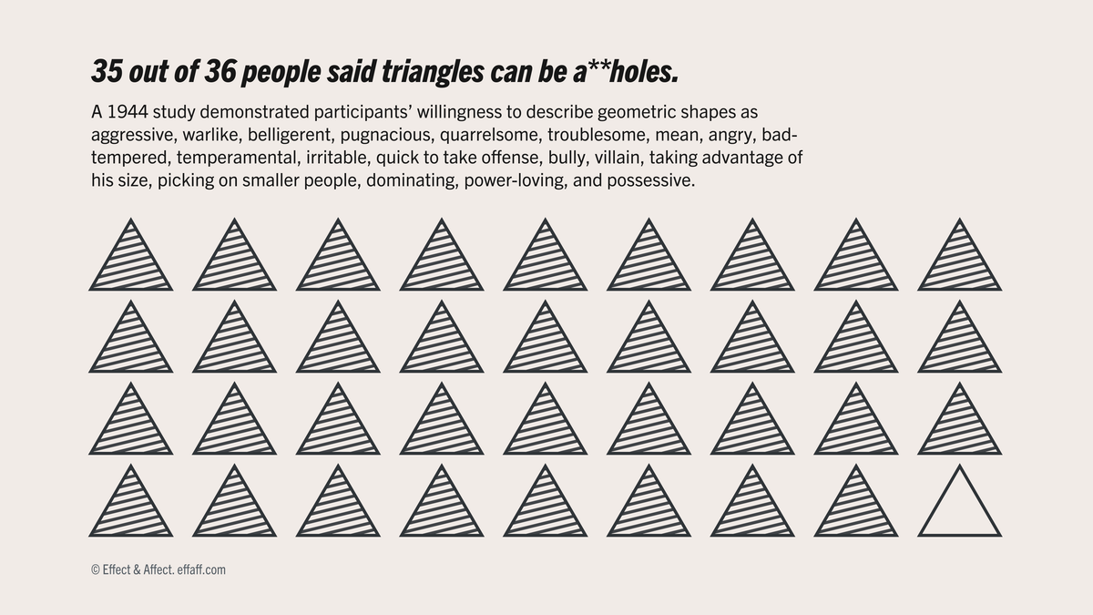
- 97% described the big triangle as aggressive, possessive, and belligerent.
- 47% described the little triangle as heroic, valiant, and courageous
- 75% described the circle as frightened, meek, and unsure of herself (61% described the circle as feminine)
Again, none of these explanations are strictly supported by the video. But this translation, from meaningless moving shapes to an elaborate interpersonal struggle, is deeply baked into how we see the world. Our brains are pattern-matching machines. We're quick to convert coincidental signals into causal narratives.
Further still, the tendency to imagine motivation, agency, and intent, without any actual evidence, is deeply baked into how we see other people.
It turns out, we also do this with data. We need constant reminders that “correlation isn’t causation” because when we see correlation, we almost can’t help but imagine causation. When we hear that White people live longer than Black people, we disproportionately (and unreasonably) attribute the disparity to genetic differences. We see economic outlook driving presidential approval, instead of approval driving outlook (or, perhaps more realistically, a side effect of increasingly galvanized partisan loyalties).
What does this mean for dataviz?
- As humans, we’re quick to see stories where we shouldn’t. This means there’s no guarantee that the stories that are supported by a dataset will be the same as the stories people imagine when they’re viewing a chart. There's a difference!
- When we’re looking at a visualization, especially if we’re evaluating it critically, two questions should be top of mind:
- 1) What does the data say, strictly?
- 2) What might the data suggest?
- These two questions are also important for making visualizations. As communicators, it’s our job to make sure that what the data says and what the chart suggests are as closely aligned as possible.