Sketching Sketchy Bar Charts
People systematically misinterpret bar charts of averages. In a pair of clever drawing experiments, Wellesley researchers highlight three surprisingly common bar-driven fallacies.
A fun thing that happens with dataviz: You spend hours and hours researching a story, pouring through the data, and lovingly crafting a perfect chart. Then you present it to your client or boss or followers, and they point out a crucial, fatal flaw:
“OMG, why isn’t this a bar chart?!”
You take a deep breath. You try not to reveal that a little piece of your soul has died, leaving a smudge of black ash, just to the left of your heart.
But you’re a professional! You also know there’s merit to their feedback. Bar charts are known for being low-fuss and straightforward, and that’s often the better choice than something needlessly fancy.
But are bar charts really as straightforward as they seem? Let’s test it out.
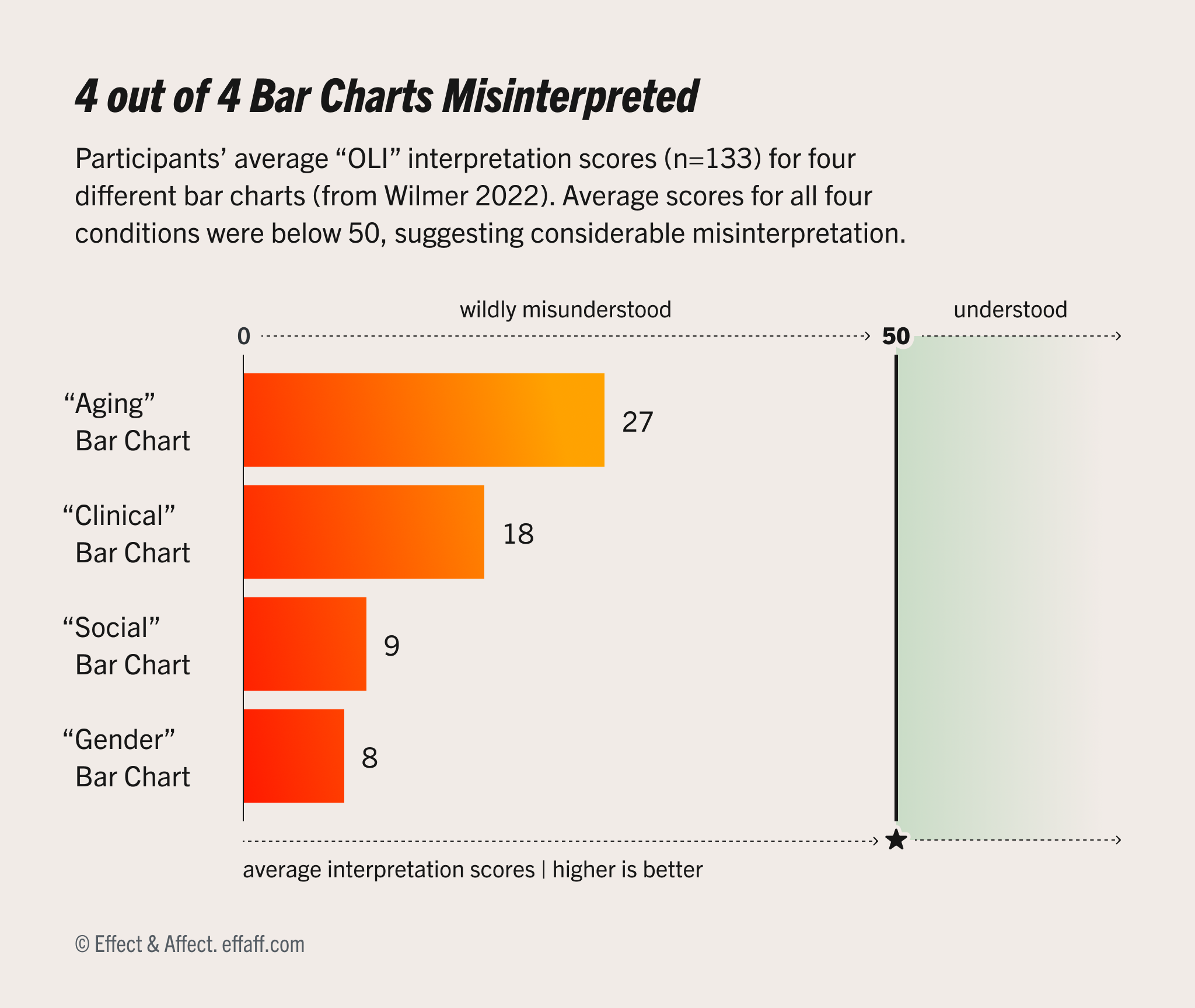
Above is a bar chart about misinterpreting bar charts (Ooo, meta!). It shows how accurately people interpreted four different bar charts, covering four different topics from Wilmer & Kerns’ experiment: gender, social science, clinical, and aging. Each bar represents 133 participants’ average OLI interpretation scores, which is an accuracy measure we’ll unpack later.
How would you interpret this chart? Even without understanding “OLI,” you can still read some of the basic facts:
- The “Aging” bar chart did the best (27), with a nine point gap between to the next best “Clinical” chart (18).
- The “Gender” bar chart did the worst, with the lowest average score (8).
- All four charts had average scores below 50, indicating inaccurate interpretations.
But there’s more to dataviz than parroting these basic facts. Visualizations also create a mental impression about the shape of the underlying data, which influences our interpretations in important ways.
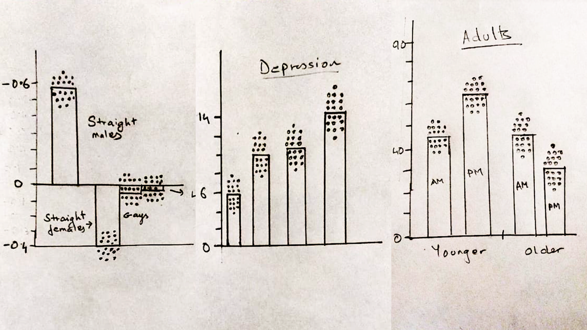
When you imagine the data behind this chart, what does your mental image look like? If you were to draw out the data points behind these averages, where would they go?
If you’d like to check your interpretation, pause here, grab some paper and a pen, then:
- First, draw a quick outline of the chart above.
- Then imagine the individual test scores for the people who took Wilmer & Kerns’ test.
- Then for each of the four bars, draw 20 dots to represent the scores for 20 random participants.
- Then read on to find out how to interpret your interpretation.
Jeremy Wilmer and Sarah Kerns, researchers at Wellesley College, ran a pair of drawing experiments where they asked participants to redraw a set of four different bar charts, then annotate the bars with dots representing where they imagined the underlying data might be in the original dataset. Notably, they did not make participants suffer through “bar charts about bar charts,” but we won’t hold that against them.
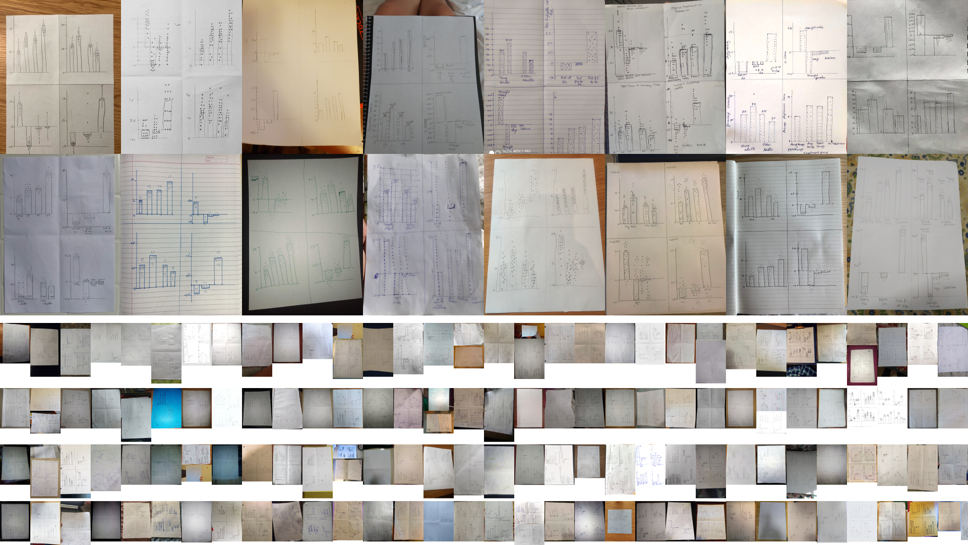
In their 2022 study, 134 participants responded with a stack of 536 hand-drawn bar charts. At 20 dots per bar, they ended up with 40,000+ dots that they could scan, analyze, and compare, to understand how people imagine the underlying distributions behind the charts.
Their headline result: 76% of those 536 sketches showed at least one major misinterpretation of the data behind the stimuli charts. That is, most people misinterpreted most of the bar charts.
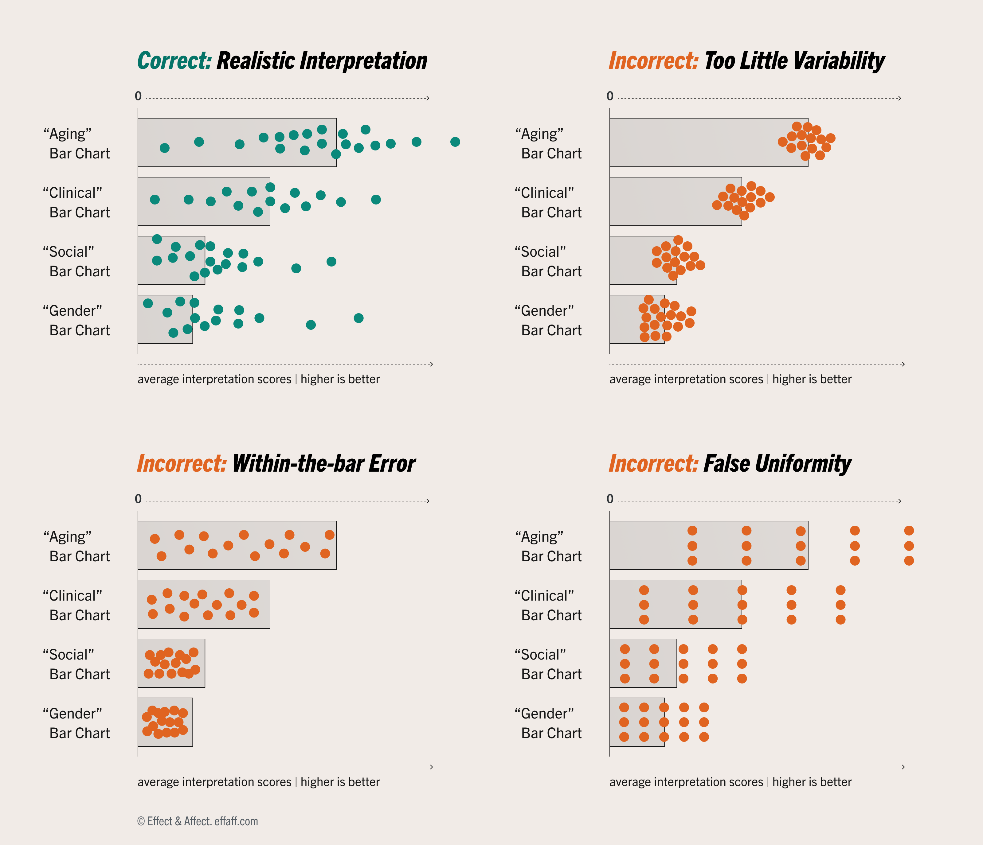
For the topics in the study (as well as our meta bar chart), a realistic interpretation would look like the green plot above, showing distributions that are centered(-ish) around the average, widely dispersed, overlapping between categories, and probably with some normal(-ish) shape to them.
But only 24% of the 536 sketches looked like the green plot. Instead, when they imagined the underlying data, most participants showed one of three common misinterpretations:
- Underestimating variability: 217 (40%) drawings underestimated the amount of variability in the distribution. So even though these distributions should overlap across categories, people assumed there was little-or-no overlap. Willmer and Kerns refer to this as the “dichotomization fallacy” because, in effect, it leads to viewers falsely assuming there are clear divisions between categories. The “OLI” score in the meta bar chart refers to the "overlap index" in the study.
- “Within the bar” bias: 129 (24%) drawings showed the data points falling inside the area of the bar, rather than balanced around the bar’s end point which represents the average.
- False uniformity: 125 (23%) drawings showed the data as evenly distributed and ignored the shape of the distribution.
Not only are these misinterpretations common, they can have serious downstream consequences. For example, underestimating variability can lead to overestimating the differences between chart categories, with downstream impacts like:
- Mistaking coincidence for causality.
- Nudging business leaders into overpaying for ineffective equipment.
- Misleading patients into accepting medical treatments they might otherwise decline.
- Reinforcing harmful stereotypes about people from marginalized communities.
What does this mean for dataviz?
Many of us have heard the critique “that could have been a bar chart.” But despite their perceived simplicity, bar charts of averages can be surprisingly misleading.
- Charts can show accurate data and still be misleading. Misleading visualizations aren’t just about miscomprehension and biased decision making, they can also reinforce downstream beliefs with wider social implications.
- Avoid bars for showing averages, where they systematically mislead viewers about the underlying data and the reality behind the chart. (For that matter, be wary of single-point dot plots and confidence intervals, which are also susceptible to exaggerated differences or underestimated variability.)
- Ideally, anytime we’re showing an average, we’re also showing the data behind the average. We’re in a golden age of fun, compact, comprehensible ways to show distributions, like swarms, quantile dots, areas, rain clouds, violins, jitters, ranges, prediction intervals, ridges, histograms, gradient intervals, or even simple line charts. Most of these plots can be overlaid with averages and stacked to replace bars, and, importantly, each of these do a better job of showing the breadth and variability of the underlying data.