Read the room
What can dinner parties teach us about dataviz? Thanks to ensemble perception, your brain is weirdly good at parallel processing faces, grass, and zillions of lines on charts.
Your brain is weirdly good at parallel processing faces, grass, and lines on charts.
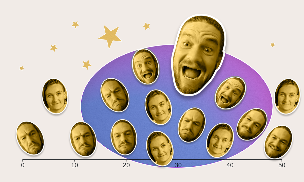
Imagine you show up late to a dinner party. You're quite late. Not stylishly late, more like offensively late. You walk in to greet the group, who are already seated. When you look across the large table, the eight guests stop their conversations. They look straight at you. Without thinking about it, you probably have a good sense of whether they’re more happy to see you, or more grumpy that you’re late.
Let's also imagine that, earlier in the day, some social scientist had created a scale of how grumpy or happy each person might look (where 1 is the most grumpy and 50 is the most happy), enabling us to quantify their emotions. And... for accuracy, let's assume the eight guests at the table were identical, octuplet siblings. So apart from their different emotional expressions, they otherwise look very similar.
In this perhaps contrived scenario, you'd actually be able to look across the table and, in less than a single second, accurately judge the average emotional state of the eight other dinner guests.
In 2007, Jason Haberman and David Whitney, researchers at UC Davis ran a study just like this. They found that people are weirdly good at converting sets of faces into an intuitive summary statistic (e.g. finding the average, the midpoint, etc.), and we can use that summary statistic to make precise follow-up judgments (e.g. does a new face look happier or sadder than the crowd?).
This is a remarkable feat of our visual system. Despite the relative complexity of emotional judgments, our brains can form these summaries very quickly (in less than 500ms) and for a large number of faces (they tested up to 16). And we do all of this in parallel and unconsciously.
This ability to visually summarize groups of objects is called ensemble perception.
Ensemble perception isn’t just a useful skill at dinner parties. It’s also how you can look across a field of grass and see which direction the wind is blowing, without studying each individual blade of grass. Our brains consider the grass collectively, treating it as a texture, throwing away the details of individual elements, and keeping the overall gist.
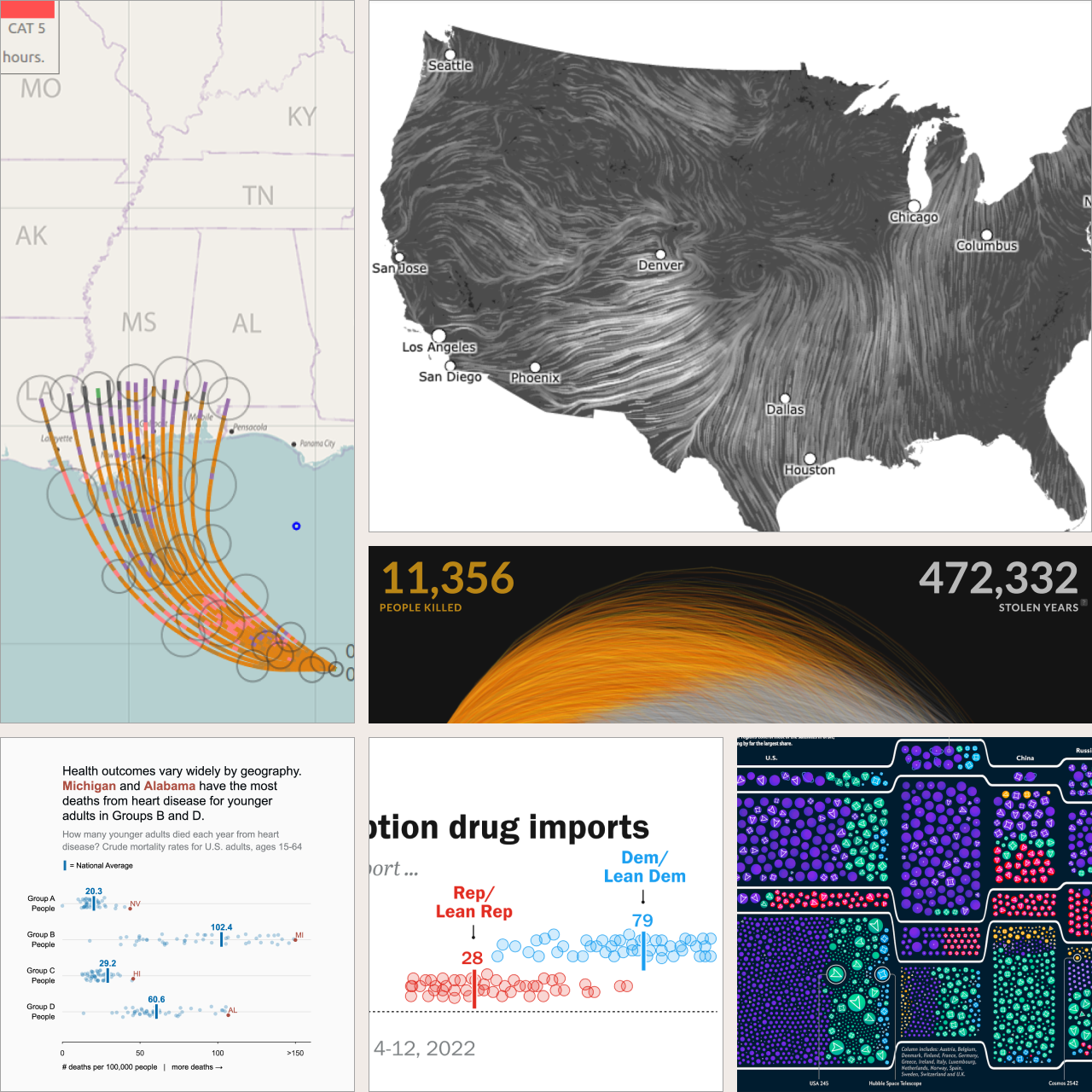
Data visualizations like these take advantage of the ensemble effect. Our brains are also very good at processing large sets of little markers on charts and maps. For example, Fernanda Viégas and Martin Wattenberg's famous wind maps show how thousands of lines (and even more data points) collectively flow across the United States. These maps show an enormous amount of detail, but you don’t need to trace each line to get the overall effect.
More practically, ensemble charts can also help with particularly tricky design challenges, like showing geographic uncertainty in hurricane predictions, time series forecasting Covid spikes, or jitter plots showing variability in social outcomes like life expectancy or household income.
What does this mean for dataviz design?
- Snap judgments aren’t always bad. Our brains take a lot of shortcuts to save us time and energy. Over the last 30 years, the worlds of psychology and economics have shown how these snap judgments can lead us to silly conclusions. But it’s not all bad! Ensemble encoding is an example of a cognitive shortcut that can be quite helpful, both at dinner parties and in charts and graphs.
- More detail doesn’t have to feel more complex. For example, bar charts and dot plots seem simple in terms of data-ink ratios, but they can be quite misleading. On the other hand, jitter plots are great for showing distributions, even though they put more “ink” on the page. Thanks to our visual systems, our brains can process a zillion dots into overall gist statistics, as if we were viewing a more reductive chart type.
- Data can be texture. Data isn’t limited to profound insights or crisp takeaways. It can also work in the background to create visual interest or give a more diffuse sense of which way the breeze is blowing.