When is eleven scarier than twelve?
About 23 years ago, a team of psychology researchers played an elaborate trick on their students, convincing them that an 11% risk of a disease was more likely than a 12% risk. How did this happen?
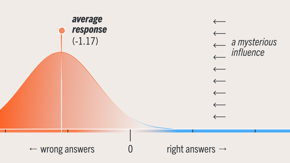
About 23 years ago in Iowa, Paul Windschitl and his team of psychology researchers played an elaborate (if mundane) trick on their students, convincing them that an 11% risk of a disease was more likely than a 12% risk.
Of course, eleven is less than twelve, so how did this happen?
The students were first given three fake facts about three fake diseases:
- Stomach churn discomfort (SCD) involves embarrassing stomach noises after a sugar binge. It affects 4% of men and 11% of women.
- Wine-breath disease (WBD) makes your breath smell like you’ve just had a boozy brunch. It affects 1% of men and 2% of women
- Gluten bloat condition (GBC) causes excessive bloating after a gluten-loaded meal and affects 20% of men and 12% of women.
To put yourself in their shoes, pretend you’ve spent a few minutes reviewing these factoids. Then you go watch cat videos on TikTok for a few more minutes. When you come back, the researcher pops the big question:
"Are women more vulnerable to stomach churn discomfort (SCD) or gluten bloat condition (GBC)?"
With the data in front of you, it’s hopefully clear that GBC’s 12% risk is greater than SCD’s 11% risk. But these absolute risk numbers aren't what sticks in our minds. Instead, when we try to apply this information to judgments like “which disease is worse?” our brains work from gists like:
- Gross stomach thinger (SCD) impacts more women than men.
- Gluten bloaty thinger (GBC) impacts more men than women.
These gists have a quirk though: Instead of capturing the absolute risk values, they focus on women's risk relative to men's risk.
This is an example of a contrast effect. In the same way that lukewarm water feels hot after holding an ice cube, risk for one group can feel exaggerated when compared to another group with lower risk.
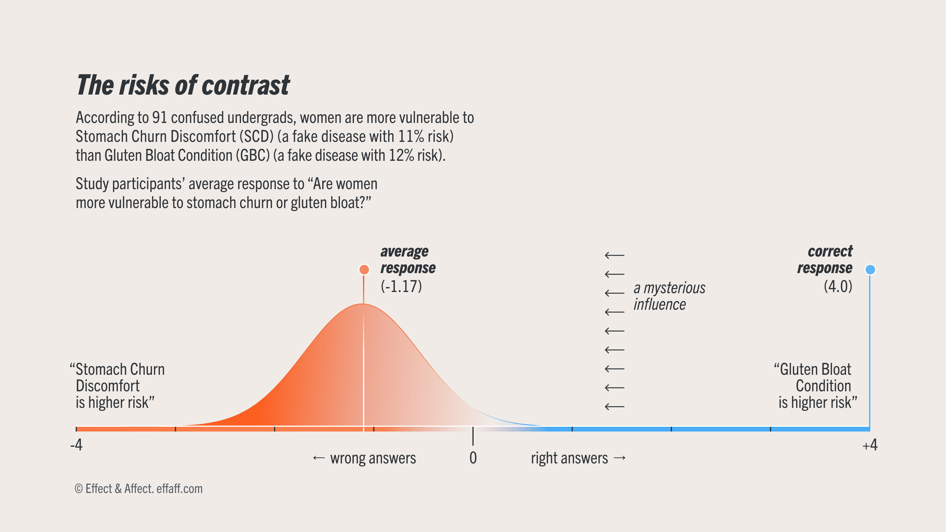
Windschitl's experiment showed that these exaggerated, relative gists were strong enough to override the absolute risk values included in the factoids, tricking his students into believing that SCD's 11% risk was more likely than GBC's 12% risk.
In this experiment, Windschitl only used text conditions, not charts, but later work from his lab showed similar effects where people mistake relative risk for absolute risk in bar charts. Frameworks like Valerie Reyna’s Fuzzy Trace Theory suggest these “gist” takeaways are quite common and might actually be more important for influencing decisions and behavior than more precise reads of the data.
What does this mean for dataviz design?
- We probably shouldn’t fuss too much about how precisely our charts convey specific values. In many cases, as long as readers take away the right gists, the chart is doing its job.
- Context matters. Twelve is always greater than eleven, but depending on which other comparisons you’re making for context, it might not be remembered that way.
- Twelve is always greater than eleven.